Wednesday, 18 December 2013
Link to Alternate Music Conventions
http://attwillg.blogspot.co.uk/2011/09/conventions-of-alternativeindie-music.html
Locations/ Call Sheets
Location 1 - Industrial
Location 2 - Beach
Location 3 - Woodland
Location 4 - Studio
Testing Cameras
In order for our video footage to be the best it can be we have decided to test out different cameras, lenses and focal ranges to see which camera best suits our interests and plans for the final music video.First we have borrowed a camera from college, a Panasonic HC-V110 2.51 MP Camcorder - 1080i

We used this camera in the studio with a few close ups of each character to test the focal range and depth of field of this camera. However we found that this camera was not as advanced for the shot types that we have planned on doing. For example we cannot do very good pull focuses with this camera and our planned footage includes a lot of them. The two videos below show the result from this camera.
After analysing this footage we have decided to use my own camera which is a Canon EOS 650D.
We have tested this camera out with some reccee footage on the beach location that we have planned - see blog post 'Testing Camera Focus & Tracking Shots'.

Digipak Construction
After taking images at an industrial location I have used Photoshop to manipulate my images in order to create a final image that will used on one of the panes of the digipak.
Using layers, various blending modes and multiple images i have created a final image that represents the industrial part of the planned digipak. The screenshots below show how I have overlaid images and decided what blending modes work best.

The image to the left shows the layers palette and how i have used multiple images with different blending modes in order to create the final image.
To fit in with the stylistic conventions of our chosen genre I have added noise and film grain in the image to give it a grainy, old style film look. I also darkened the edges of the final image and boosted the contrast so that the final piece looks like an old style photograph.

To incorporate the idea of nature combining with industry and match the style of our music video i have tried experimenting with various colour overlays. The screen shots below show overlaying browns and yellows to create a monochrome image.

The final image can be seen below.

Photoshoot (Characters From Video)
In order to create the final images for our digipak, we have constructed a second photoshoot that includes shots of me and Liam in the studio. We are going to combine these images with previous industrial and nature images to create final images that contrast each other as well as fit in with our initial ideas and reflect our chosen genre. The images will also fit in with the generic styles of similar bands as instead of having typical "band shots" we are taking an artistic/stylistic approach.


Photoshoot
To create our digipak we need images of industrial and nature locations as well as portrait shots of characters from the music video. This photoshoot contains industrial images that i have taken as a first photoshoot for the digipak and advert development.


Rough Cut 1
This is our first rough cut for our music video. As you can see it is very rough and we still need a lot of footage and we need to add some more things such as filters and film grain. However the footage we have, we have put in place of our animatic shots which has helped us as a guideline to decide where each shot goes. We have tried effects in some places, for example 0:40-0:46 where we have over-layed several clips of footage to create the double exposure look.
For our next rough cut we are filming the footage of the band in the studio and footage of the female character in the park - nature footage. Afterwards we will think about adding more effects and stylistic filters to create the planned look of our final media product.
Digipak Construction 2
To progress further with the construction of the digipak, I have edited some images from our photoshoot from the studio and combined them with nature and earth elements to create interesting, experimental portraits. This idea was influenced by a photographer that i like: Matt Wisniewski.
As planned in the planning phase of our project we are still going ahead with the idea of having interesting landscape shots combined with 2 panes filled with an image of each character. The final images on this post are the two that are going to be used for the characters. This leaves 4 panes remaining on the digipak: the front cover we are unsure what final image we are using yet, the back cover, and 2 extra panes that we are going to place some of our final landscape images in.
The screenshots show how I have used Adobe Photoshop to create this images using various layers, masks and blending modes.

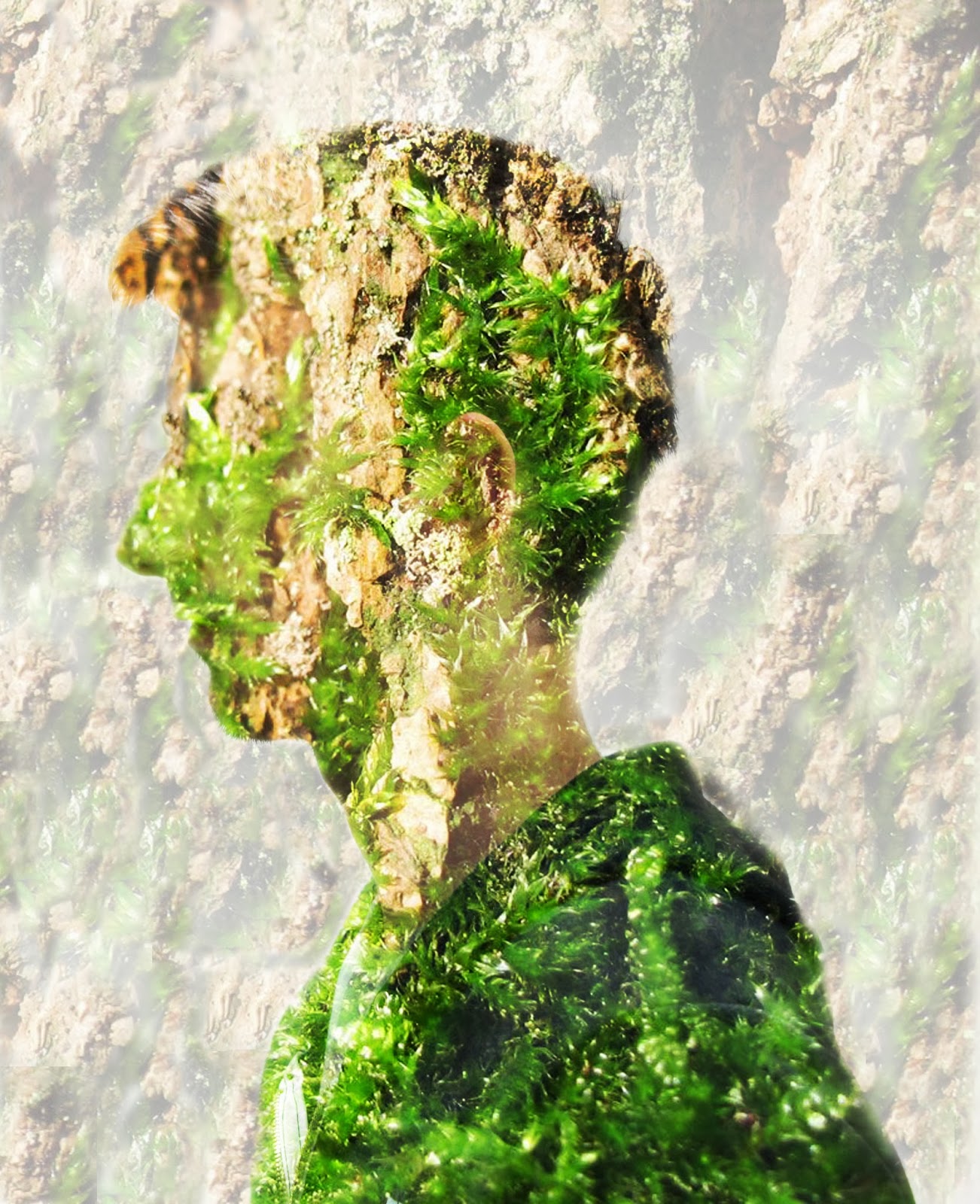

These screenshots show the stages of progression when creating the image. To fit in with the stylistic concepts and artistic style of our chosen genre I have used a filter in photoshop to add noise to the image. This results in the final image(s) having a grainy appearance, combined with high contrasts this makes the images have an old, film style about them.


The two final images can be seen below:


Rough 2 - Sigur Ros
Rough Cut 2 includes move footage with the wide screen effect and adjustments with colour correction tools.
Tuesday, 10 December 2013
Permission To Film Location
Before going out and filming at our desired locations we have emailed Hartlepool Borough Council and asked for the permission to go ahead with our project. Hoping that they respond with permission, we will then film as planned at these locations.
Below is a screen shot showing the email that we sent to Hartlepool Borough Council.

Budget Planning
.png)
When planning our music video project we have realized that our ideas and plans for the video include a lot of travelling, as well different elaborate costumes. Because of this we have decided to budget our video and therefore estimate the outgoing costs that we need to think about before filming.


First of all, are the locations. We have decided on three outdoor locations as well as filming in the college TV studio. We have found out that the TV studio is free to use, and therefore will not cost us anything. Our furthest location is the Industrial locations on Tees Road.
Looking on Google Maps the location is about 8.5 miles away, which is not too bad but will contribute towards the cost of petrol as we have decided to travel by car.
Seaton Carew beach is a local location that is approximately 2 miles away from us. The woodland area we have decided to film in is again local and will not require much travelling – it is about 1.8 miles from us.
In total that is 12.3 miles of travelling we have to do, however we are filming some shots in the locations on different days – for example we are going to the Tees Road location twice. Therefore the overall travel is 20.8 miles. After doing some research this will cost us about #5 on petrol, which we believe is reasonable.
The other thing we need to take into account is how much our equipment, props and costume will cost. The masks we are using in our video we have to make ourselves from materials that we are going to source.
The first ‘leaf’ mask in the video will not cost much to make as the leaves are coming from my back garden. The only cost will be a plain mask and superglue, which comes to about #4. The second ‘clay’ mask we are making is going to cost about #7 for the clay and milliput that we are using.
In terms of costume in the video we are wearing clothes that suit the style of our video however we are not buying them, just sourcing them from our own wardrobes so this is free.
We have also discovered that the camera and tripod and other equipment that we are lending from our college is free to use so again this will not cost us anything.
Therefore the total cost for our music video will be about #16, which we believe is very reasonable and easily manageable.
Practising Studio Set-Up
Practising Studio Set-Up

Prior to filming our band shots in the studio, we needed to plan and prepare it. We noticed during our research, that a primary focus was the lighting. To avoid our shots looking cheap or unprofessional we set up 4 VISIO DMX Dimmer Lights behind where the band would go.


Once we positioned and angled the lights, we realised we wanted to add a more ethereal, ambient effect. By doing this we got hold of a roll of Blue Tinted Plastic and taped it over the cameras. For full effect we double layered the plastic, ultimately adding a blue tint to the lights.
We also realised, that with this blue tint, we could change the colour the colour balance in post production and easily modify the hue, meaning we can have the lights to look any colour we want without majorly distorting the colours of the band/actors.
Digipack & Advert Ideas
In order to fit in with our chosen style and genre we are planning our digipak images to match the style of our music video and hence give our full project a sense of identity that the target audience can recognize.
As our chosen band (Sigur Ros) are quite arty and don’t follow typical “band type” conventions we have ruled out the idea of having a band photoshoot. Instead we have discussed having landscape images as well as double exposures including characters from the narrative side of the music video.
We are also keeping with the nature/industrial theme when planning and constructing our digipak and advert. We have discussed that the colour scheme is important so we are keeping natural tones, high contrasts of greens, browns, and yellows.
When discussing the idea of having characters from the music video in the digipak, the idea of using Photoshop to layer nature and industrial style images to create interesting portraits. This idea came from influence from the photographer Matt Wisniewski. He has created portraits that are double exposures of people and landscape images (see images below).


Some of our draft ideas and sketches can be seen in the image below.

Digipak Template
In order to understand the layout and composition of the digipak that we are going to make, i have downloaded a 6 panel digipak template from the internet. I have then opened it in Photoshop where i will use is as a guideline to drag images into for the final outcome.
An idea we have is to have a landscape image that will fill up 3 panels, and then have the remaining 3 panels of characters from the video combined with nature and industrial elements to create stylistic portraits. This template also enables us to see where the images will be cut and where the digipak will fold into the final thing.


Choosing Font Types
As we are in the process of constructing our final images for the digipak, we have realised that the type face we use for our text is vitally important. To explore and decide on the type of font(s) we have used the website 'dafont.com' to view and try out some different type faces.
When planning our digipak we decided that we want to keep the front cover very simple, with perhaps just a single image and the band name and/or the single name. We have decided this after researching some band album covers for inspiration earlier on in the project.
We are still unsure whether to include both the band name and the single name on the digipak front cover but we have decided that the majority of the text as well as the company logo will feature on the back cover of our digipak.
We have decided that the font we want has to be quite scrawled as if it has been hand written, however we still want it to be fairly legiable. This type of handwritten/calligraphy style font fits in with our chosen genre and matches the generic conventions of that genre. Some of the images of the fonts we tried out can be seen below.


Monday, 25 November 2013

Subscribe to:
Comments (Atom)